13 · Projects
Pôle emploi, IT department (Bertin)
Pôle emploi – Testing a recommendation engine
The request
Pôle emploi, the French public employment service, was adding "On vous guide" to its Emploi Store: a recommendation engine that points users to the services that match their answers. Its usability had to be assessed with future users before launch.
The solution
I ran tests with thirteen participants, in a rural area in Seclin and an urban one in Montreuil: free exploration, scenarios, interview, SUS questionnaire and an A/B test of two versions of the questionnaire. I delivered an 83-page report with illustrated recommendations, such as keeping the access to the engine above the fold.
The protocol
Thirteen participants, seven in a rural area in Seclin and six in an urban area in Montreuil, with varied profiles: age, situation, ease with the internet. Each session mixed free exploration, scenarios (finding a service with the search engine, then with the recommendation engine), an interview and a SUS questionnaire. Two versions of the questionnaire, vertical and horizontal, were compared in an A/B test. I wrote the findings and recommendations.
The fold
Very few participants scrolled the home page. On the Seclin computers, the entry point to the recommendation engine fell below the fold: it simply went unnoticed.
Montreuil
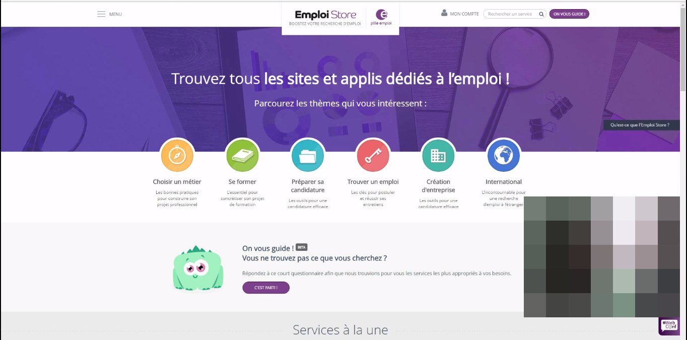
Seclin

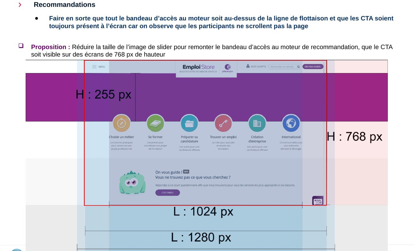
The questionnaire
Many hesitated: could they pick several answers, was every question mandatory? The information was there, at the top of the page, but few read it. In the A/B test each version had its case: the vertical one takes fewer clicks, the horizontal one guides step by step and shows how many questions are left. And most participants preferred the version they had not used.
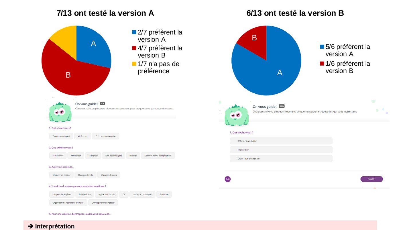
Most participants preferred the version they had not used.
The results page
On the results page, the actions at the bottom went unnoticed and « Recommencer » (start over) made people fear losing everything, when all they wanted was to adjust one answer.
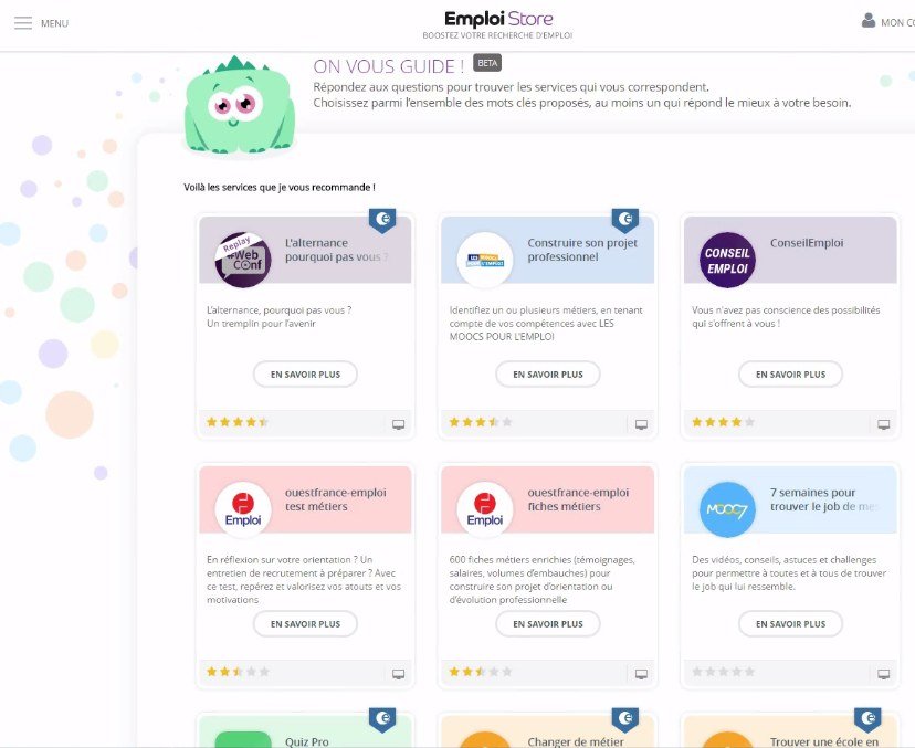

Measure, then qualify
The average SUS score came out at 65, with a high standard deviation (19.3): three participants, two of them barely at ease with digital tools, pulled the average down. Hence a detailed, participant-by-participant reading rather than a single number.