01 · Projects
Personal project
Risk OS, a design system for financial risk monitoring
A showcase in a field I know well after more than six years at Murex: monitoring limits, spotting a breach and understanding where it comes from. Foundations, domain components, patterns and screens were built with Claude Cowork, connected to Figma through the MCP server.
An identity that leaves room for risk
The visual direction is called Iris & Slate: cool slate neutrals and a single accent, an iris (#5241CC). It stands apart from common financial design systems and, above all, never clashes with a risk colour. Geist is used for the interface, Geist Mono for every financial value: fixed width keeps decimals aligned from one row to the next.
Three colour families, never mixed
This is the most structural decision in the system. risk/* colours describe the business state of a limit, from Normal to Critical. feedback/* colours describe the outcome of an action in the interface: saving, input, export. dataviz/* colours encode categories without judgement, with no green, amber or red. The same red can therefore never mean both “limit breached” and “field to correct”. On top of that, each risk level pairs a shape, a label and a colour: circle for a stable state, triangle for a warning, octagon for a breach.
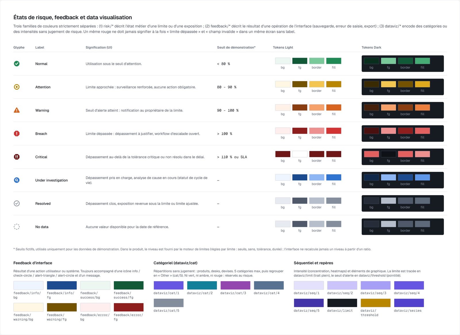
The same red can never mean both “limit breached” and “field to correct”.
The design system, built with Claude
Claude Cowork, connected to Figma through the MCP server, laid the foundations: 251 variables split across collections (primitives, light and dark colours, dimensions, three display densities, motion with a reduced-motion mode), 17 text styles, 3 elevations and a 12-column grid. Then the library: 51 icons, 34 components with variants (225 variants in total) and the application shell, sidebar, top bar, page header, toolbar, drawer. My role: set the direction, review every page, make the domain calls.
Components built for the domain
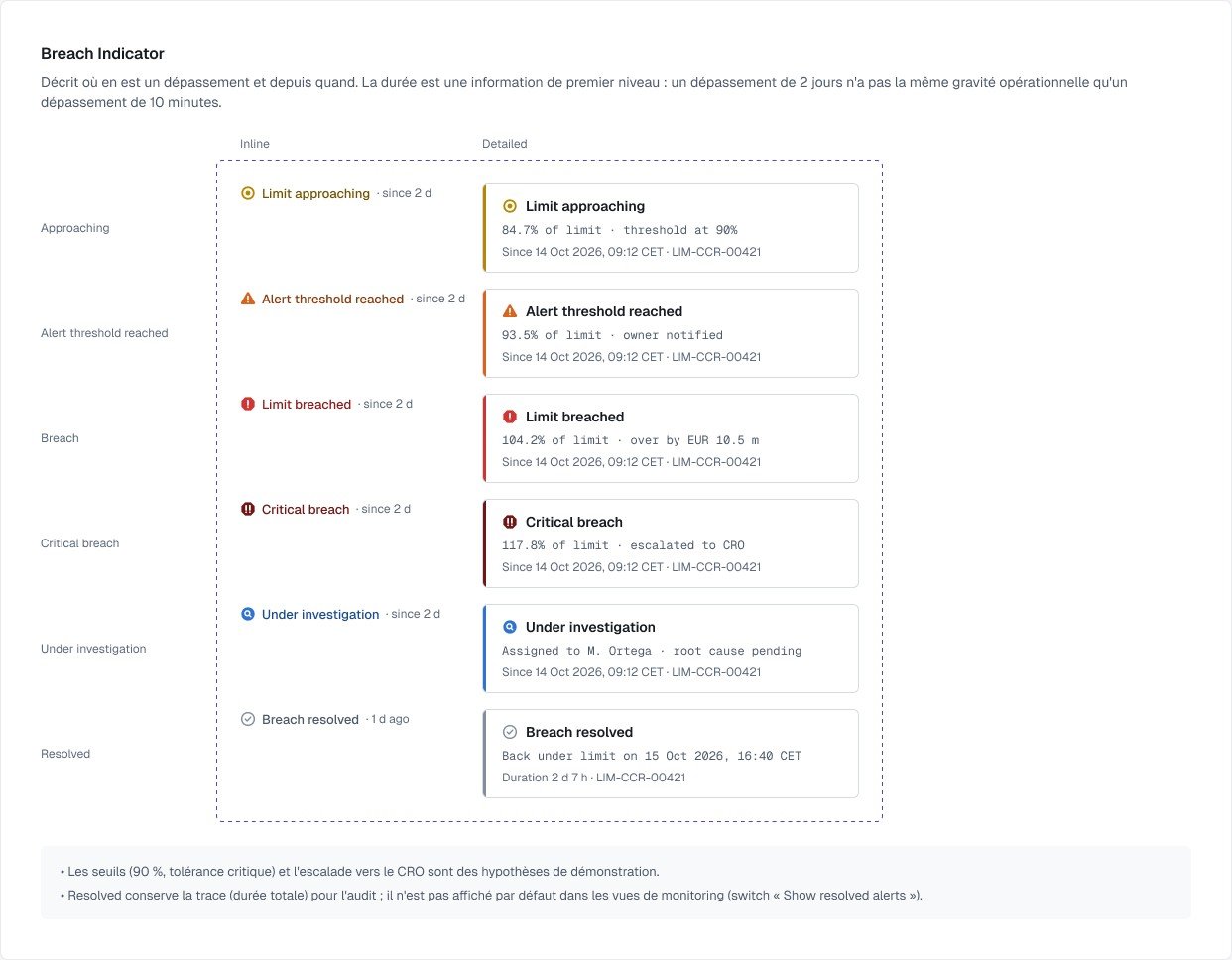
The most specific page in the file gathers the risk components: level glyph and badge, breach indicator, data freshness, delta, exposure value, limit utilisation, concentration and contribution rows, charts, alert list, history and financial table. Each one is documented with its states and usage notes. The Breach Indicator, for instance, puts duration first: a two-day breach is not as serious as a ten-minute one.
Patterns before screens
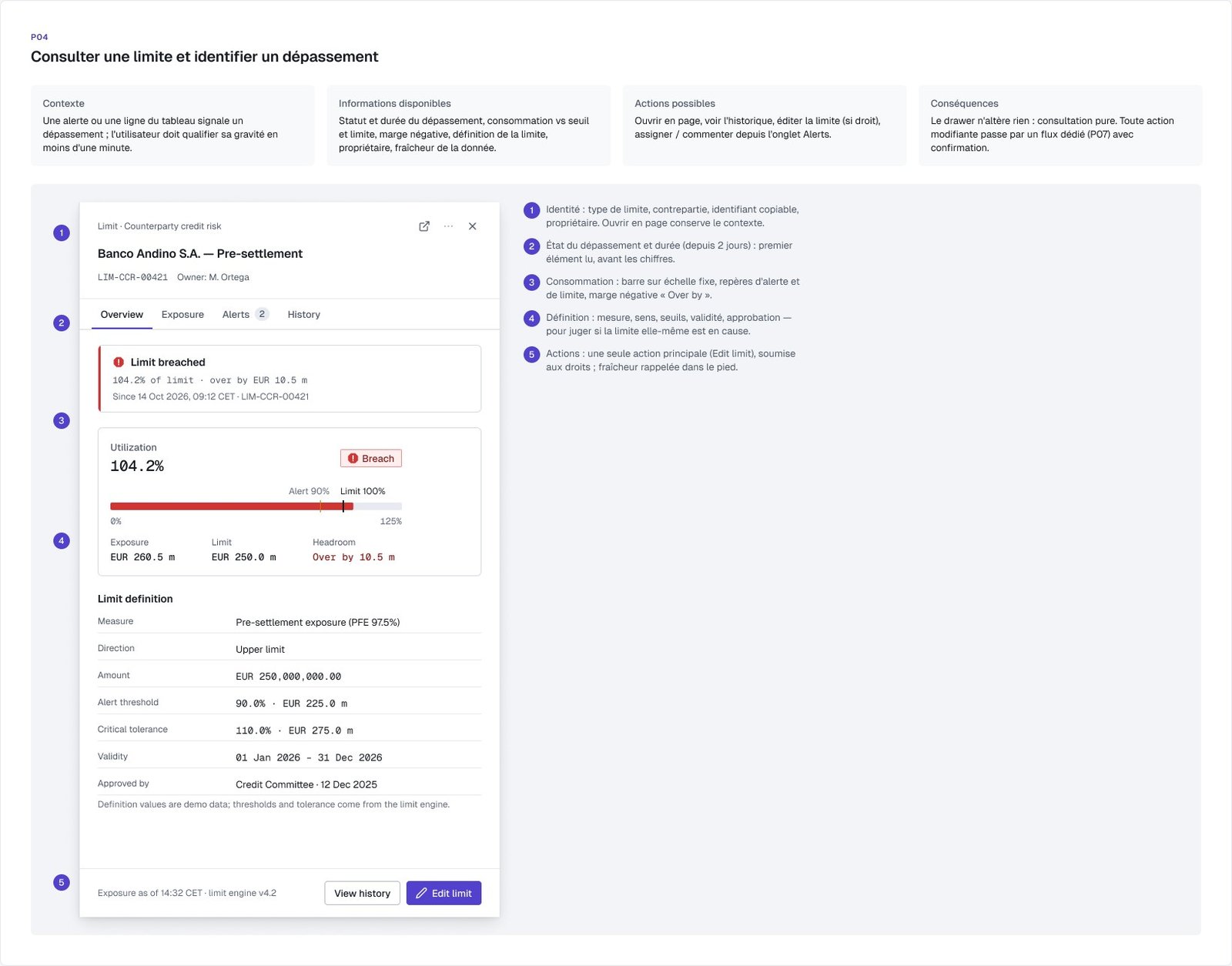
Eight patterns describe the key tasks before a single screen is drawn: filtering exposures, exploring a portfolio hierarchy, drilling from an aggregate to its detail, checking a limit, analysing the causes of a breach, reviewing an alert's history, creating or editing a limit with approval, showing data status. Each pattern sets out the context, the information available, the possible actions and their consequences.
Three working screens
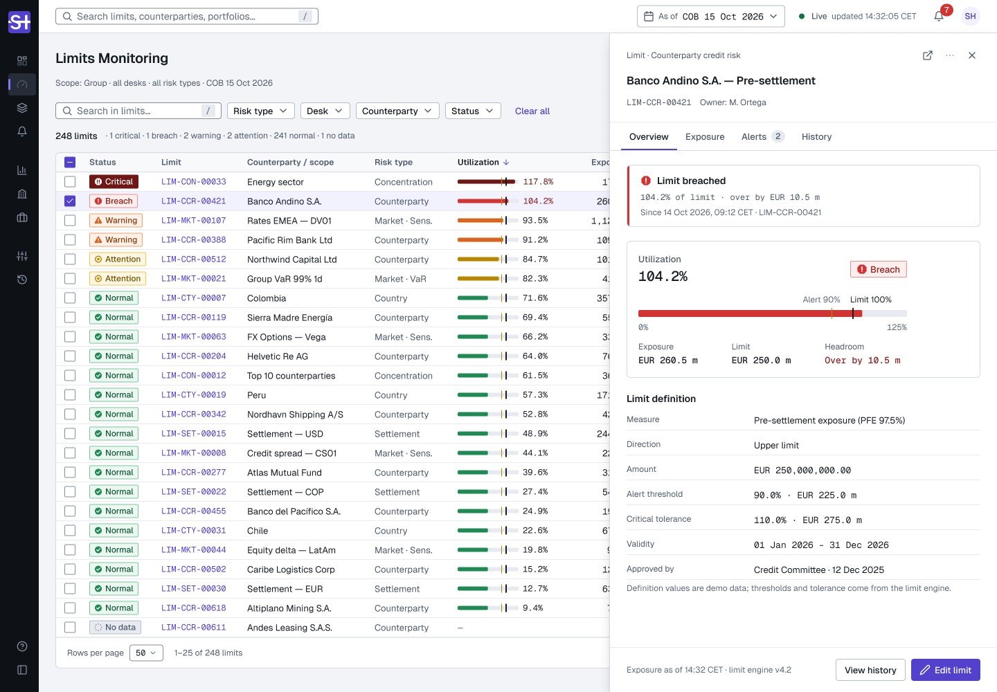
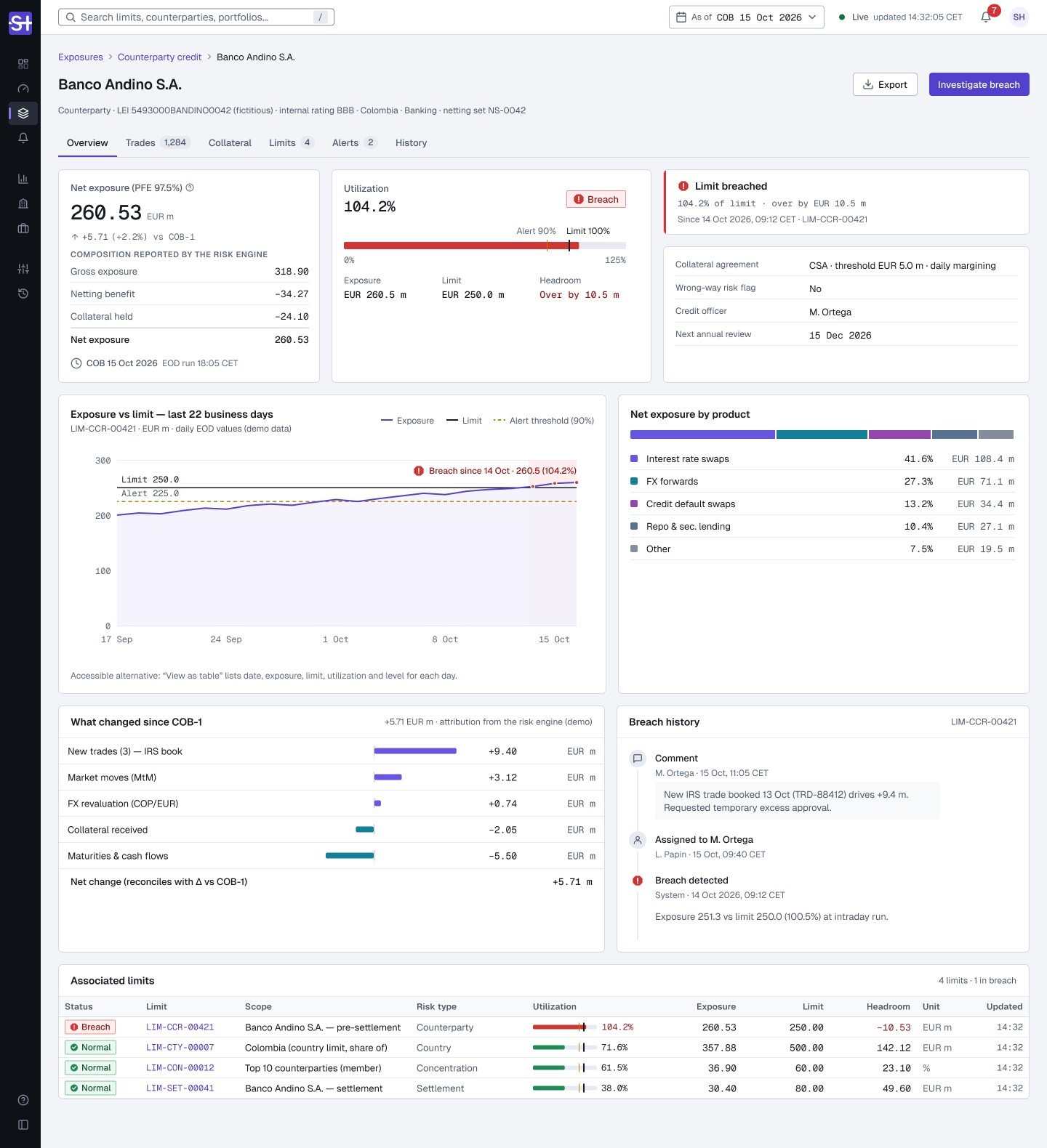
The screens put these building blocks together in compact density: the risk overview, limit monitoring with the detail drawer open, and a counterparty's exposure page, a scrolling page that goes from summary to breach history.
Accessibility
Risk level is never carried by colour alone: shape, label and colour go together, and badges keep a text/background contrast of at least 6.6:1. Components have screen reader equivalents (a utilisation bar announces “104.2% of limit, breach”), and real-time data updates are only announced when the state changes, never on every refresh. The documentation separates what is verified, what is designed for WCAG 2.2 and what remains to be checked.
A prototype to walk through the flow
The prototype follows the monitoring journey: from the overview, open the active breaches or the list of limits, click a row to slide in the detail drawer, then move on to the exposure page. Five Figma Motion animations complete it: drawer entrance, updated row highlight, notification, section expand, utilisation bar update.