01 · Projects
Personal project
A fictional CRM, from design system to prototype
A showcase project of how I work today: the design system generated from Claude Cowork connected to Figma, then the user experience and prototyping finished by hand in Figma.
Starting from a proven design system
A CRM is a dense tool: lists, records, a pipeline, tasks. Salesforce Lightning Design System 2 has already answered many of these questions, and its global styling hooks (--slds-g-color-*, --slds-g-spacing-*) give design and code a shared vocabulary. Keeping those names as they are means a screen designed in Figma can be built directly with SLDS.
A new identity on top
On that base, a visual identity specific to the project: navy blue for everything interactive, buttons, navigation, focus; a red kept for the logo and alert states; a secondary palette limited to object icons and data visualisation. For type, Ubuntu, set on the SLDS scale: 13 px base, 1.15 ratio.
The design system, generated from Claude Cowork
Claude Cowork, connected to Figma through the MCP server, created the three variable collections. Primitives hold the raw values, from navy-50 to navy-900. Foundations gather spacing (4 to 56 px), radii, elevations and text styles. Aliases reuse the SLDS semantic hooks and point to the primitives. Claude then built a first version of the components: buttons, fields, table cells, badges, tabs, cards. My job at that stage: frame the request, review each collection, adjust.
AI handles the set-up. The time saved goes into hierarchy, journeys and interaction details.
Accessibility checked from the variables up
Before a single screen was drawn, Claude checked text and surface contrast pairs at AA level. It shows in the palette: links in blue (blue-600), alert messages in dark red (red-600), and the brand red kept for the logo. Every interactive component also has its focus state, down to the checkboxes in tables.
Finishing the experience in Figma
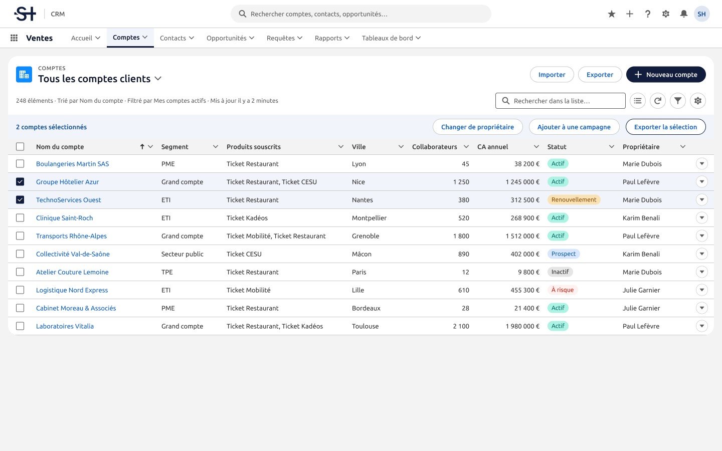
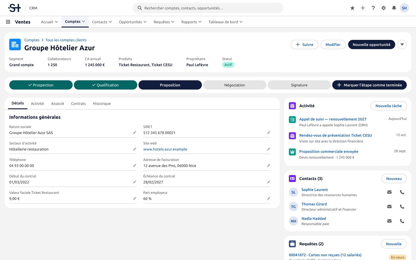
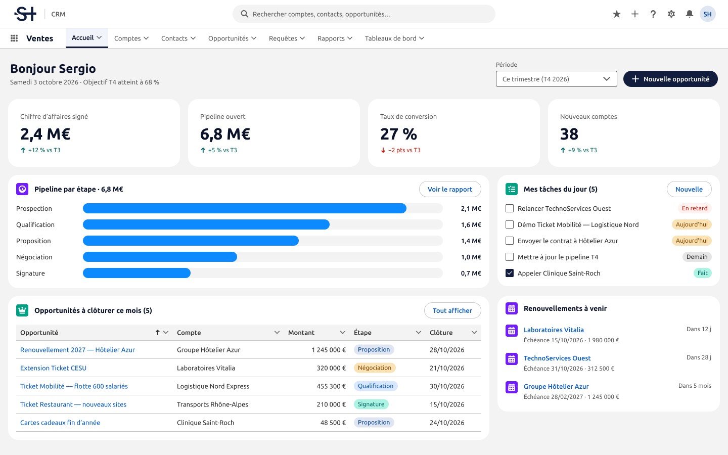
Generation gives a solid base, not a finished product. The rest happened in Figma, screen by screen: the account list, the account record and the sales home. Table density, the order of information in the record, where actions sit: that is where the experience is decided.
A prototype to try
The prototype starts from the account list. Hovering a row, selecting with a checkbox, opening the record from the account name, an action menu at the end of each row: interactions live in the component variants, which makes them reusable from one screen to the next.