01 · Projects
Client confidentiel
Streaming – Subscription platform
The request
A mid-sized subscription video streaming platform: 495,000 subscribers in France and several European countries, on web, mobile, tablet and Smart TV. It was redesigning its product, with no settled visual language or library, to convert more, reduce churn and keep subscribers longer. A seven-month engagement as the only designer, under a non-disclosure agreement.
The solution
From the first screens, I suggested building a design system alongside the mockups, with WCAG constraints carried by the tokens. I delivered a Figma kit, PDF guidelines and a Claude skill that checks the developed interfaces. Six months after the redesign, conversion rose from 2.8% to 4.1% and monthly churn fell from 7.2% to 4.9%.
Methodology
- UX audit of the existing product
- Benchmark
- Facilitation of cross-functional design groups
- User journey mapping
- Information hierarchy
- Solution proposals as wireframes
- Analysis of user analytics and business goals
- Design system built alongside the mockups, WCAG tokens
- Responsive design, from 390 px mobile to 1920 px Smart TV
- Guidelines and interface quality review
Audit of the existing product
The audit of the previous version found the friction points in the two journeys where people dropped out: account creation and subscription. For each one, the screen before and the screen chosen.
Journey 1 · Account creation
Goal: create an account quickly to get into the service.
Before
After
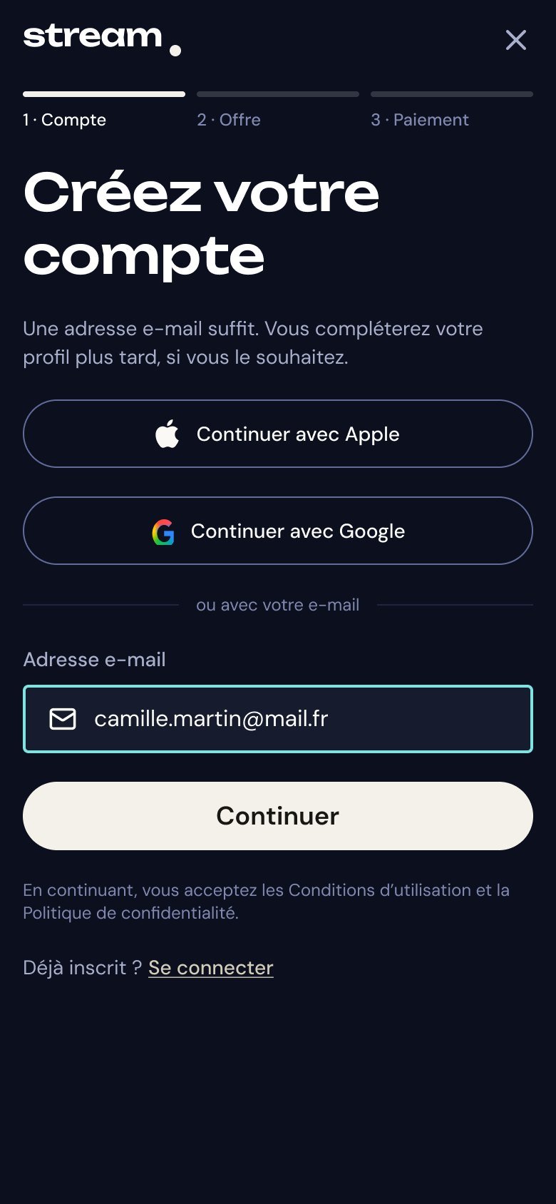
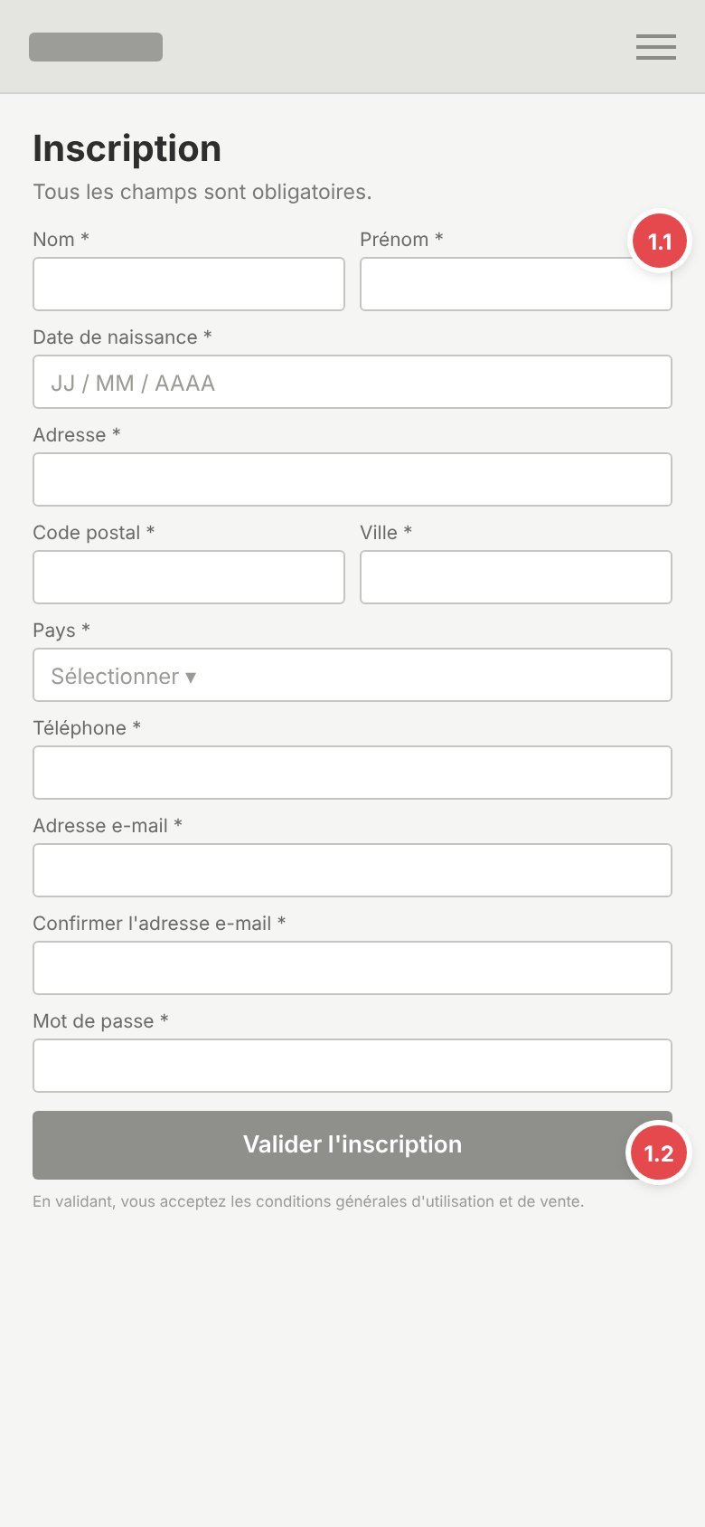
1.1Form too long
Before: name, date of birth, address, phone and email required before any access.
After: a single required field, the email.
1.2No quick sign-in
Before: sign-up through the form only.
After: “Continue with Apple / Google” comes first: an account in one tap.
Before
After
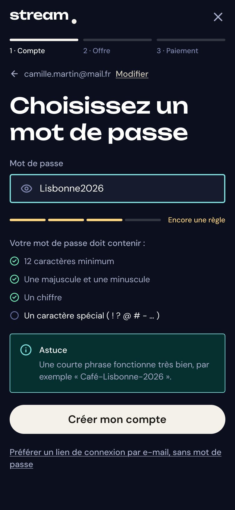
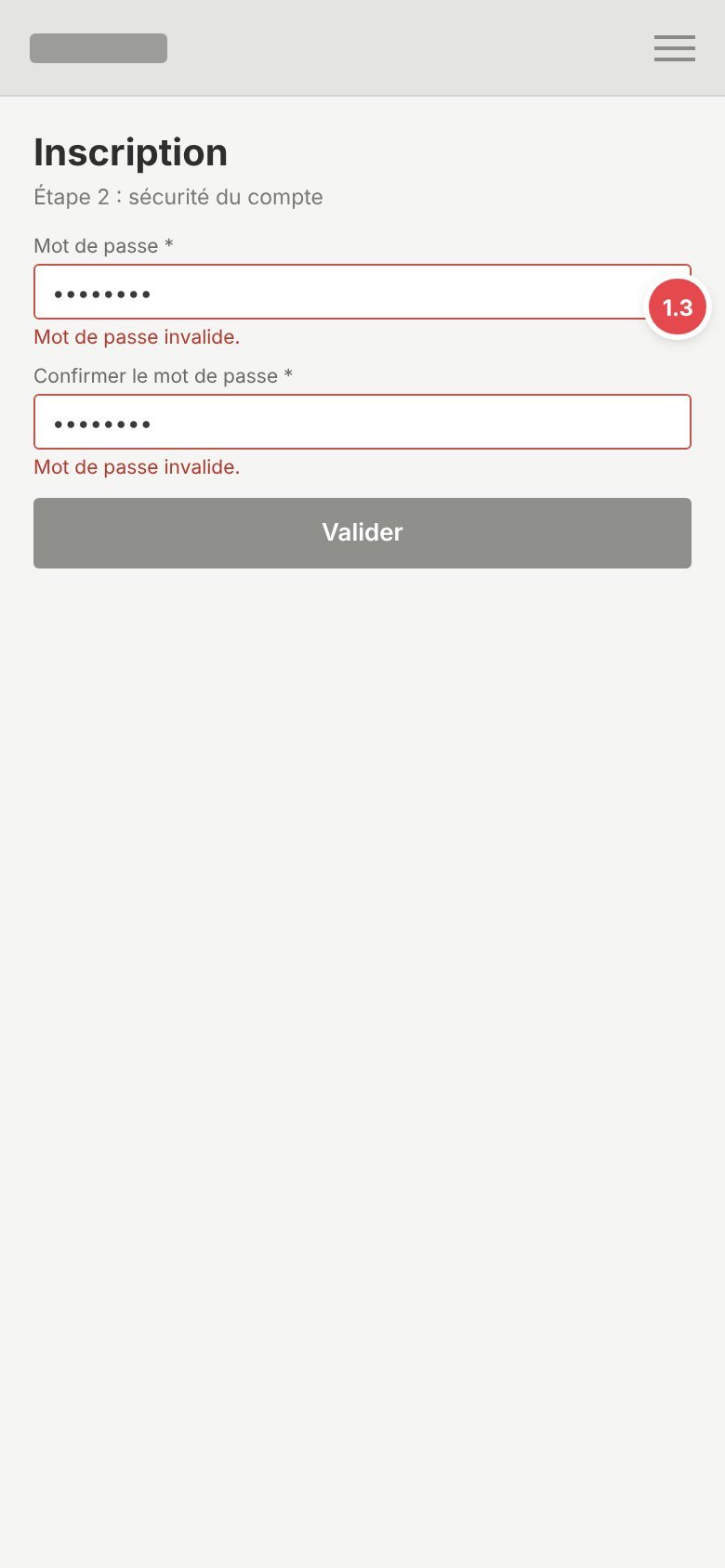
1.3Hidden password rules
Before: 12 characters, upper case, digit and special character required, with no rules shown.
After: rules visible and ticked live, password can be shown, passwordless option.
Before
After
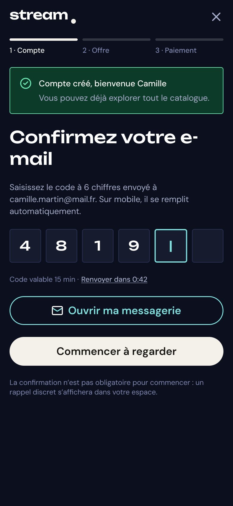
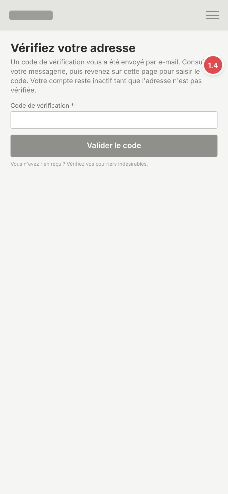
1.4Verification that sends people away
Before: a code to find in the inbox and type back, account blocked meanwhile.
After: code entered on the same page, filled automatically on mobile, verification not blocking.
Before
After
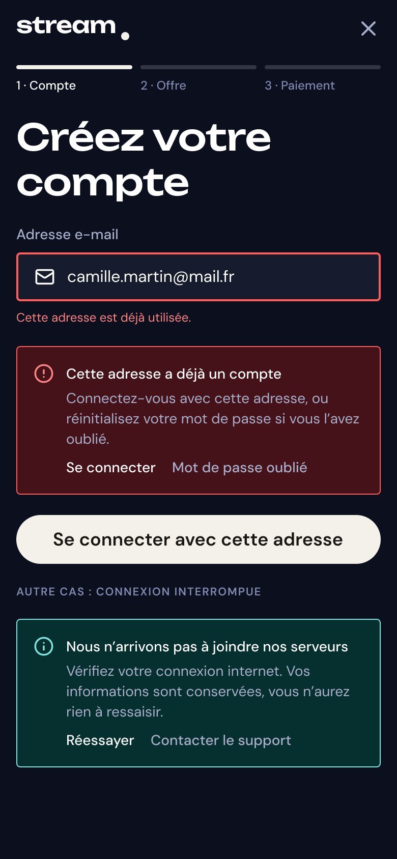
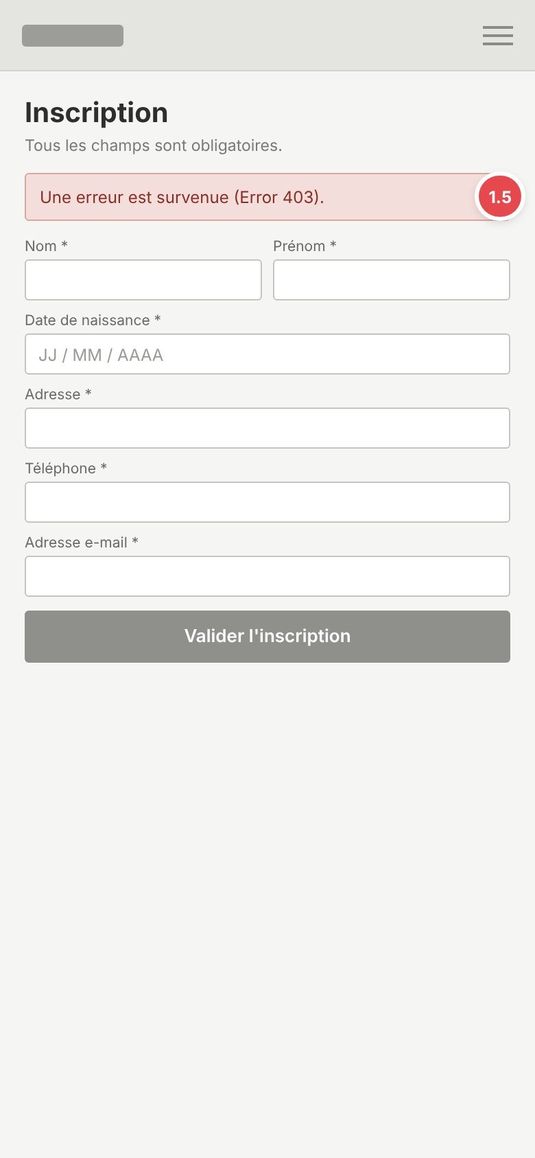
1.5Unreadable error message
Before: “An error occurred (Error 403)”.
After: what happened, what to do, one action button. Entered data is kept.
Journey 2 · Subscription
Goal: choose a plan and pay.
Before
After
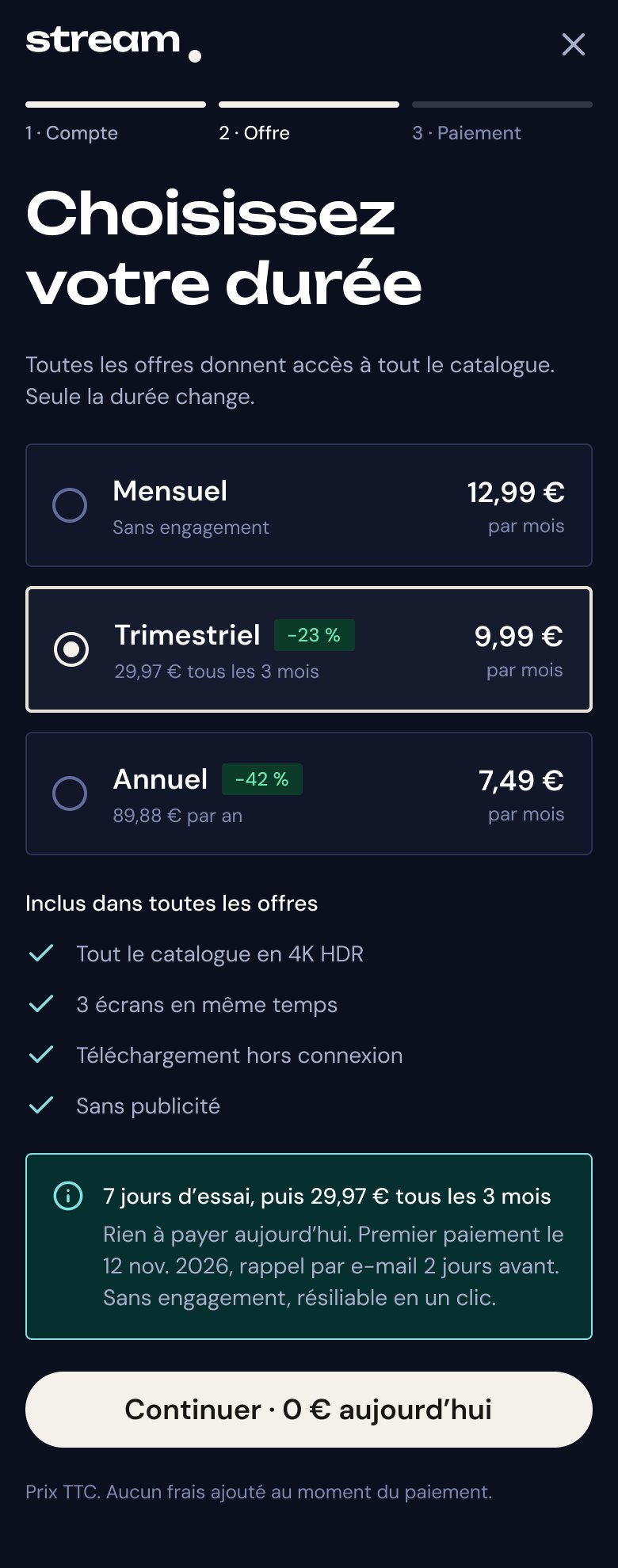
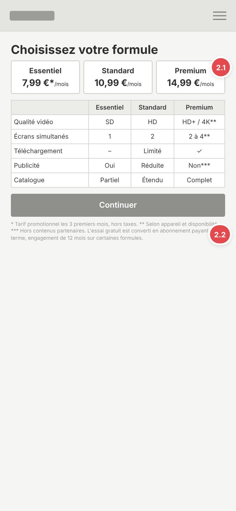
2.1Plans hard to understand
Before: three plans with blurry differences.
After: one complete plan, only the duration changes, savings shown.
2.2Hidden terms
Before: end of trial and commitment found out too late, in small print.
After: trial, date and amount of the first payment shown at the choice.
Before
After
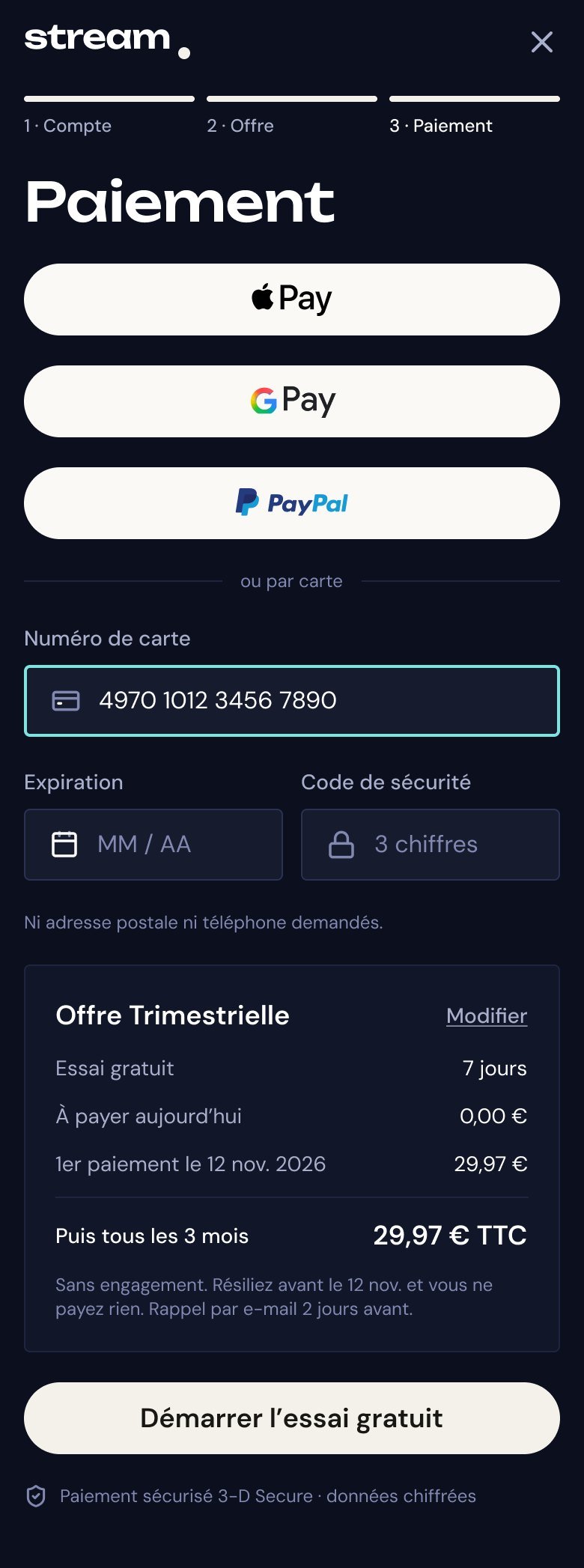
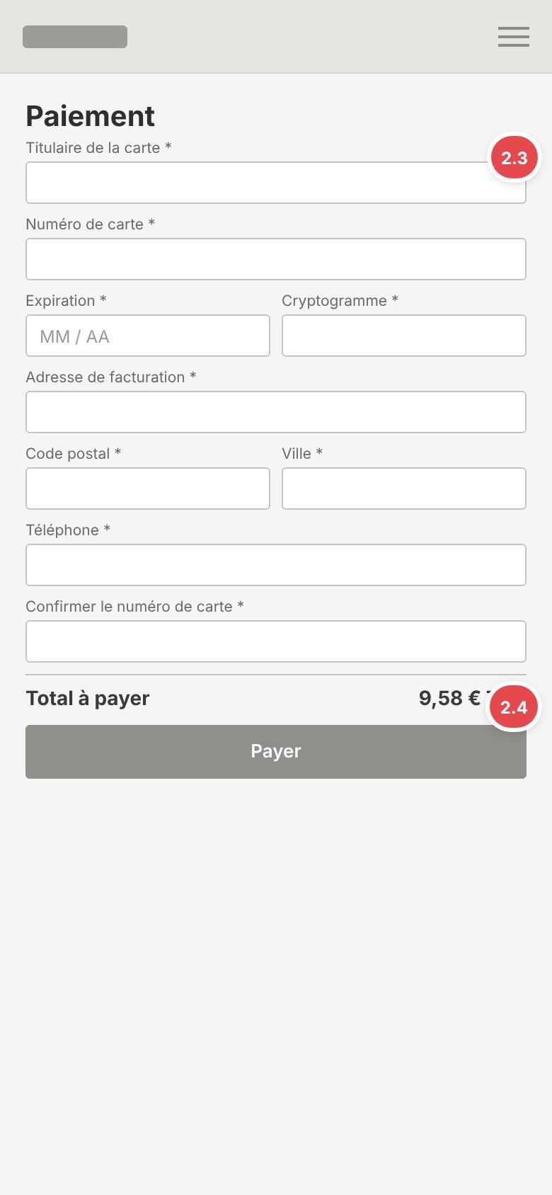
2.3Payment too complex
Before: many fields, card entered twice, no express payment.
After: Apple Pay, Google Pay, PayPal or a card in three fields.
2.4Price that changes at checkout
Before: €7.99 advertised, another amount at payment.
After: final price including tax shown at the choice and repeated unchanged.
Before
After
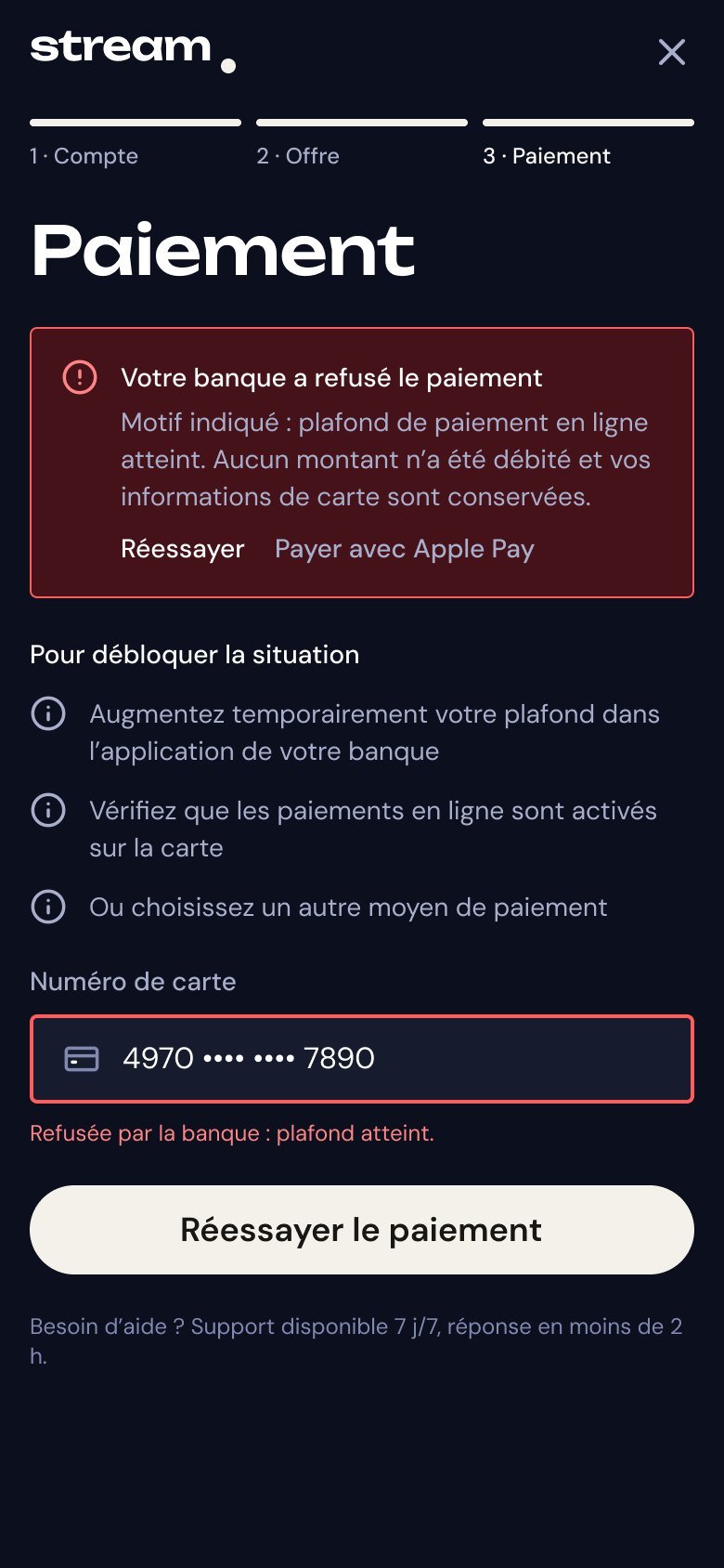
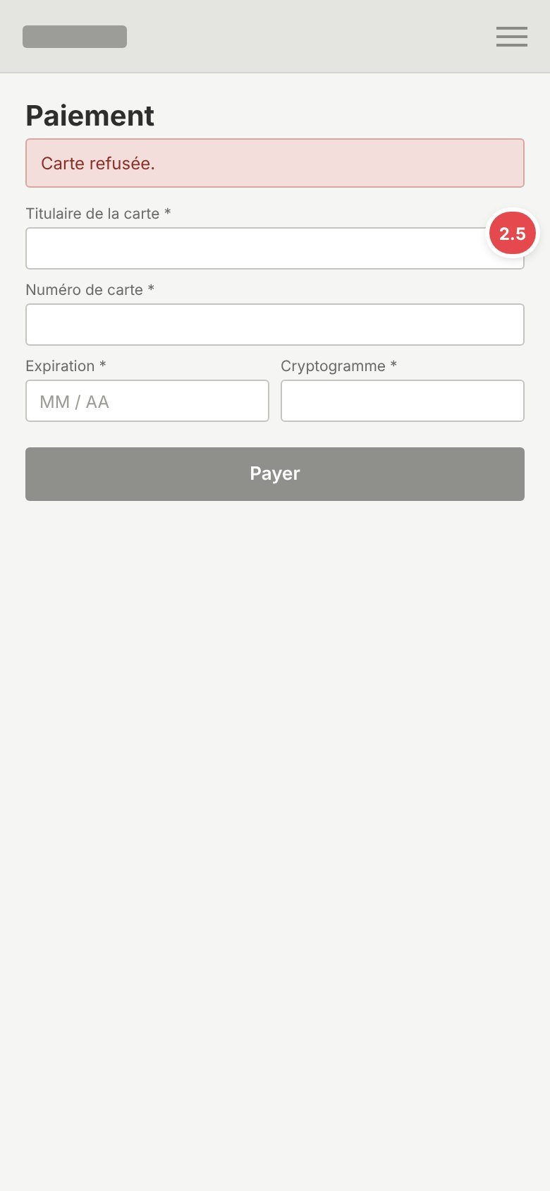
2.5Payment declined with no reason
Before: “Card declined”, with no reason.
After: reason in plain words, nothing charged, another payment method on the spot.
Before
After
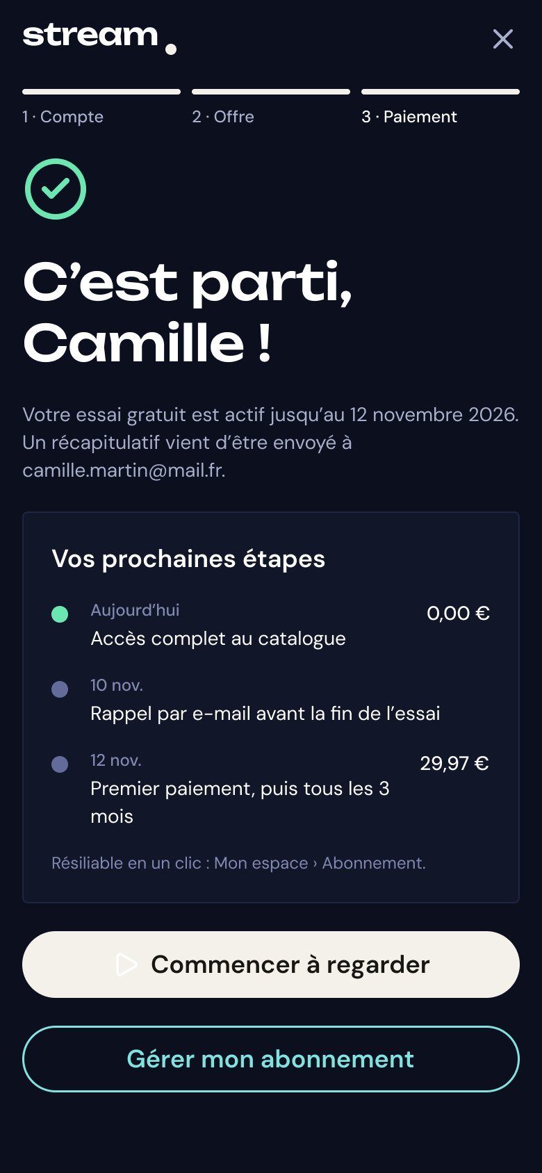
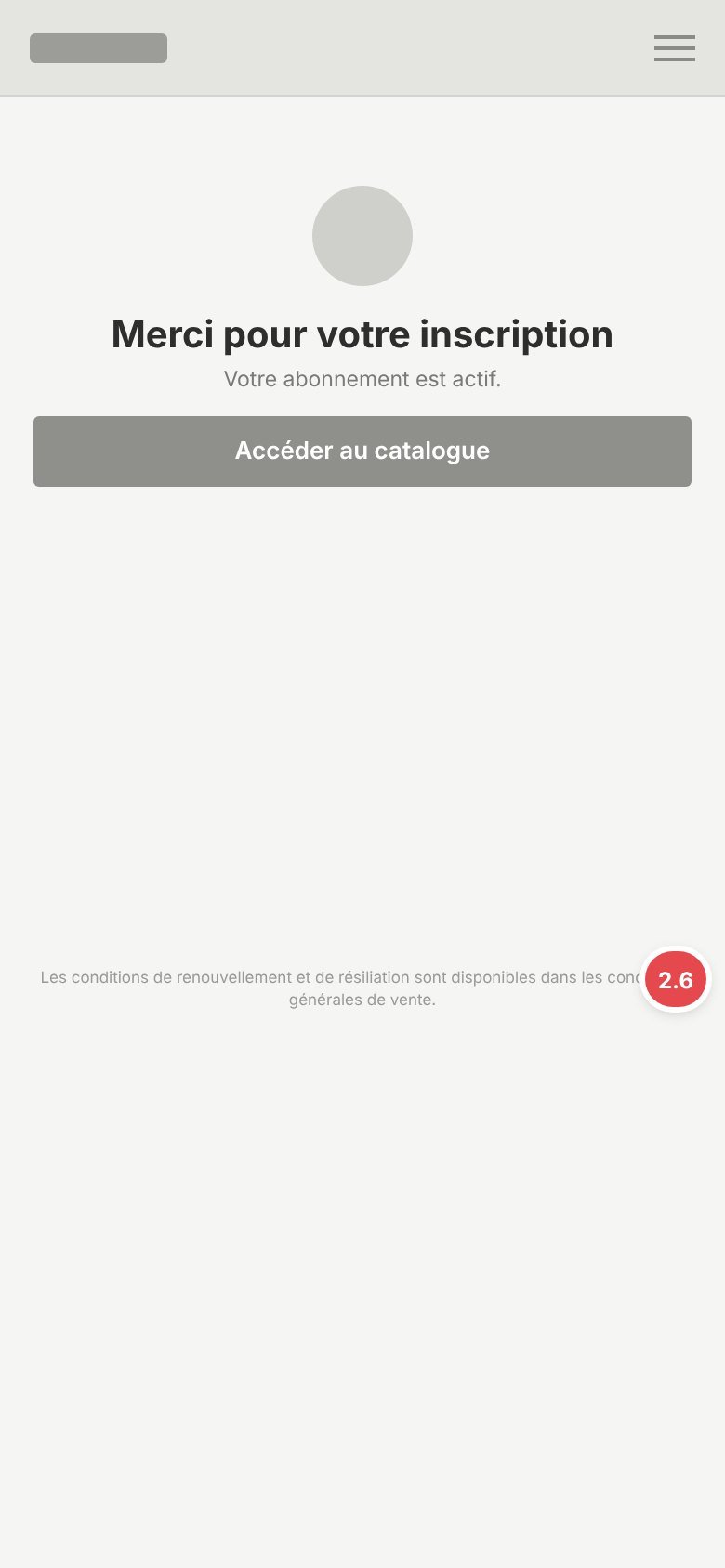
2.6Dates not recalled
Before: no dates recalled after subscribing.
After: dated next steps, reminder before the first payment, one-click cancellation.
“Before” screens rebuilt as wireframes from the audit. “After” screens from the redesign.
Responsive design
Mobile first, across six breakpoints. The same components rearrange from one device to the next.

Base. One column, tab bar at the bottom.

Wider card grids, same navigation.
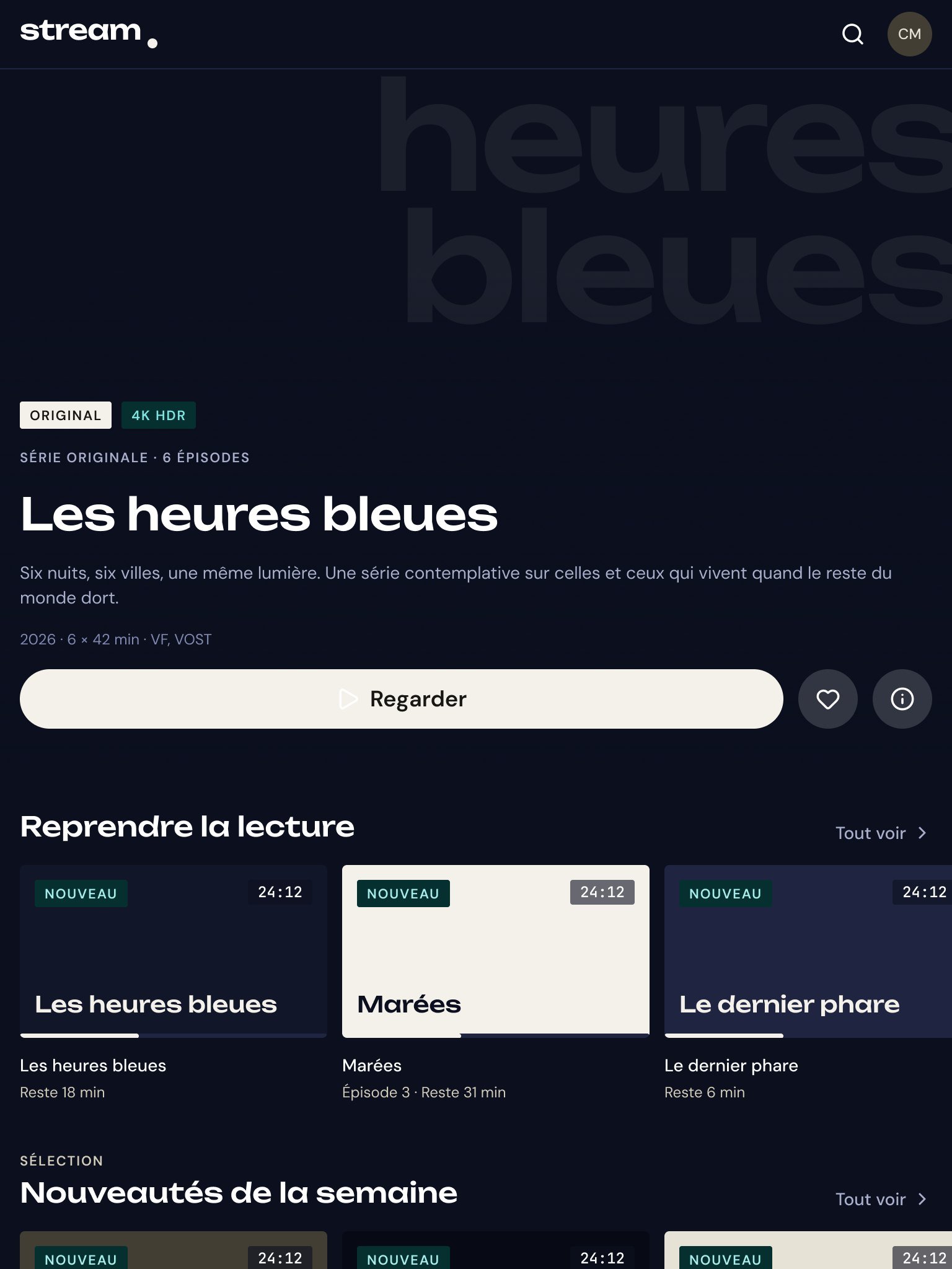
Three cards per row, tab bar kept.
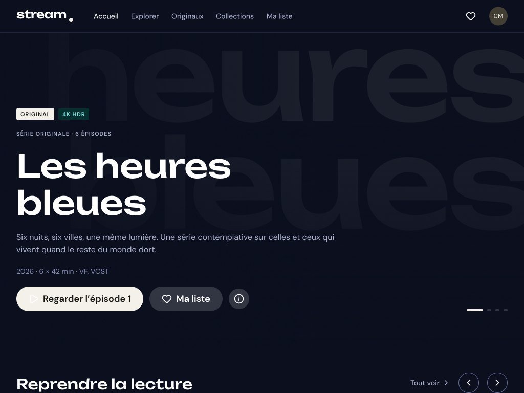
Navigation at the top, tab bar removed.

Search in the header, five cards per row.

Remote-control navigation, safe area.
Smart TV
- Read from 3 metres: larger text and elements.
- Remote navigation (D-pad): focus state always visible, no hover.
- 5% safe area (96 × 54 px) against edges cropped by some TVs.
- Designed at 1920 × 1080, exportable at 3840 × 2160 (4K).
- Sign-up and payment on the phone through a QR code: nothing to type with the remote.


What the client wanted
Six business goals: convert more visitors, reduce cancellations, keep subscribers longer, increase engagement and revenue per subscriber, and stand out from the big platforms. The problems found before the redesign explained a good part of the losses:
- a cluttered interface, weak search and recommendations: finding something to watch took time;
- thin video pages, so people hesitated before pressing play;
- a sign-up flow too complex, often abandoned before conversion;
- resume playback hard to find, and a different experience on each device;
- unclear subscription management, which pushed people to cancel.
The results, six months later
Visitor → subscriber conversion
4.1%
before 2.8%
Monthly churn
4.9%
before 7.2%
3-month retention
79%
before 68%
Net Promoter Score
+38
before +12
| Metric | Before | After |
|---|---|---|
| Sign-up abandonment | 56% | 34% |
| Clicks on recommendations | 12% | 24% |
| Viewing time per week | 4h 20m | 6h 10m |
| Videos watched to the end | 42% | 61% |
| Satisfaction (CSAT) | 68/100 | 84/100 |
| Annual renewal | 61% | 74% |
| Active subscribers | 495,000 | 575,000 |
| Estimated monthly revenue | €4.60M | €5.38M |
Two token layers, not one
Raw values, colours, spacing, radii, live in a primitives collection. A second, semantic collection names intentions: surface, border, text, state. Components only ever read that second layer. That is what makes it possible to change a brand colour without opening a single component, and to discuss decisions with the client in terms of roles rather than hex codes. The same logic applies beyond colour: typography, spacing, radii, border widths, motion durations and breakpoints are variables too.

bg/base points at color/ink/900, border/accent at color/fuchsia/500. Changing the product background means moving that link, not opening the screens.A semantic token puts a name on an intention. It is that name, not the colour, that the developer finds in the code.
From token to component
Components are built with auto layout, variants and component properties, and filled only with semantic tokens. When you select a modal and read bg/overlay as its fill rather than a colour code, that is the sign the system holds: no value is hard-coded inside a component.
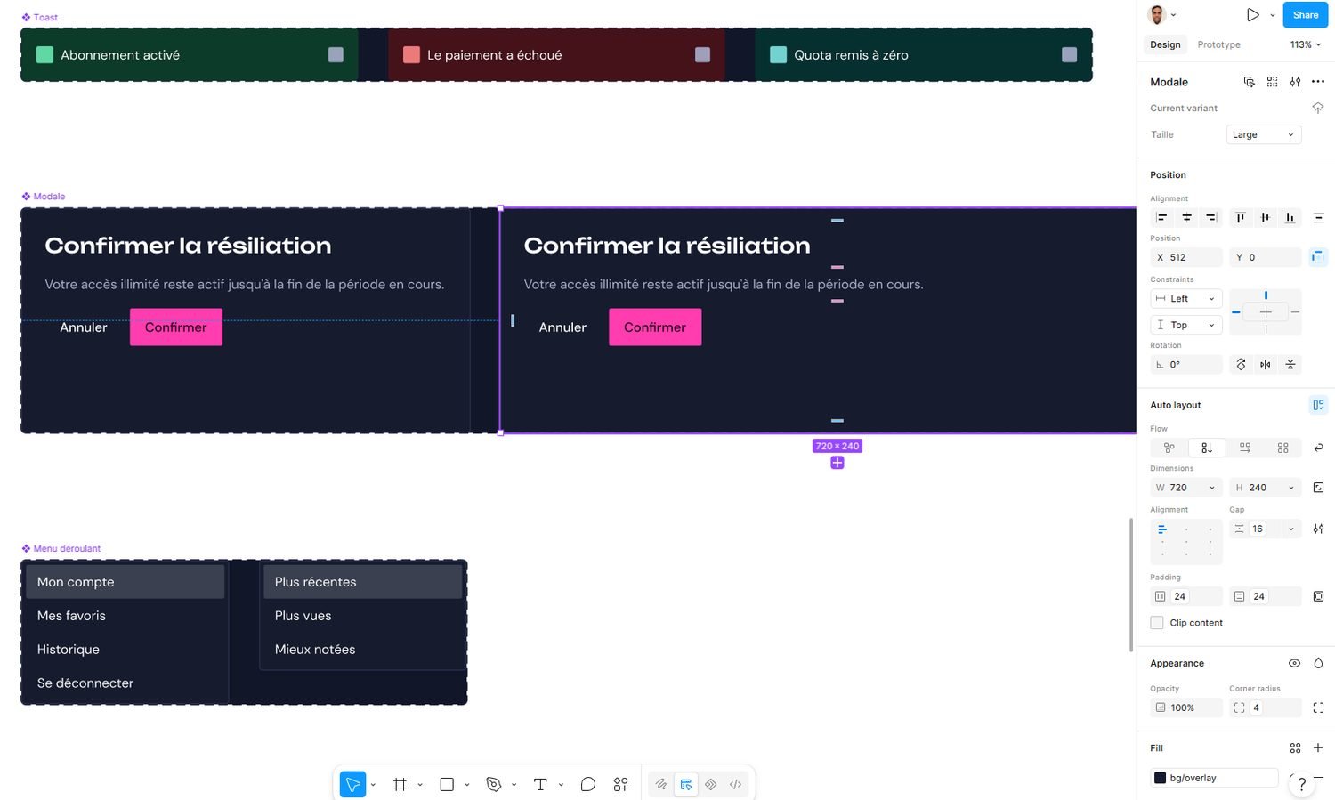
bg/overlay, a token and not a colour.What was delivered
- a Figma kit: tokens as variables, components and patterns published as an asset library;
- guidelines as a PDF: anatomy, states, usage rules, accessibility constraints;
- a Claude review skill: it reads the interfaces as built and flags deviations from the guidelines.
Quality control is part of the delivery
A design system degrades the moment it leaves Figma. The developer interprets, undocumented cases get invented, and six months later the product no longer resembles the library. The third deliverable answers that. The skill reads the interfaces produced, checks them against the guidelines and returns the gaps. The check becomes a step in development, instead of a design review that keeps getting postponed.
Accessibility
WCAG constraints are carried by the semantic tokens: a text/surface pair is validated once, at system level, and every component using it inherits the contrast. Checking a screen then comes down to checking that it did not bypass the system.